What South Australia's architecture awards are rewarding now
South Australia architecture awards 2026 point to a warmer design mood: bold colour, civic usefulness and wellbeing over white-box luxury.
Most architecture award nights reward a very particular kind of good behaviour. Hushed palette. Expensive materials pretending not to know they are expensive. Black wool, polished concrete, a glass of something pale balanced on a catalogue while everyone waits for the first citation. So I kept circling back to the language around this year’s South Australian Architecture Awards: colour, wellbeing, people, constraint. Glamour was not really the point. Monumentality was not either. The old white-box fantasy, where taste meant self-denial, suddenly looked a bit tired.
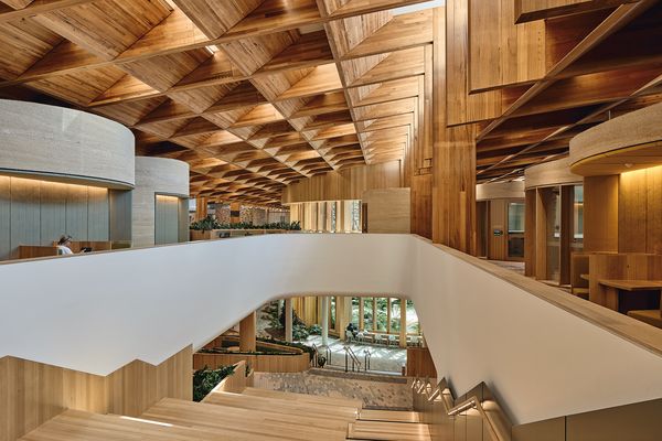
Yitpi Yartapuultiku, or The Soul of Port Adelaide, led the field with four honours, while the Moorundi Health Centre collected four honours and commendations of its own. Before you even get to the individual projects, that pairing tells you something. The awards, administered through the Australian Institute of Architects’ South Australian program, were not rewarding a single look. They were rewarding a feeling: buildings that seem interested in how a day is actually lived.
I am wary of treating awards language as prophecy. Juries love a flattering story about the present tense, and design culture can make almost any shortlist sound like a social movement if you give it enough champagne. Still, the sceptical read gets harder to hold when you place South Australia beside Victoria. In The Guardian’s report on the Victorian awards, the $53 million St Kilda pier redevelopment was praised in almost identical terms: playful, public-spirited, deeply civic. Different state, similar mood. At some point, rhetoric starts behaving like a pattern.
Over the past year, Australian interiors have drifted away from white-box perfection and back towards warmth, texture and a little emotional legibility. This awards list feels like the official version of a hunch many of us have been having at home: restraint still matters, but sterility is out.
Colour without bravado
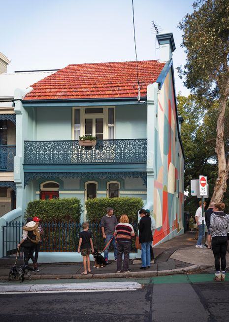
Here, colour appeared in the jury language as more than ornament. That sounds obvious, yet it cuts against the old styling-school move, where colour arrives at the end as the cushion, the vase, the one brave front door. In this year’s South Australian field, colour seems to have been read as a structural gesture, a way of giving a building social confidence without loading it up with luxury cues.
In the realestate.com.au coverage of the awards, Bickmore put it plainly:
“A confident use of colour, and inventive form-making indicate a shift away from unnecessary excess.”
Dave Bickmore, realestate.com.au
That line stuck with me because it refuses the usual false choice. Colour here is not code for indulgence, or the expensive splash in an otherwise timid project. It is a way of making a building legible, warm and a little more human under pressure. In a market where constraint is no longer an abstract creative prompt but the baseline condition, that matters. Architects are being asked to do more with less, and the smartest projects are no longer pretending austerity has to look joyless.
Across Wired’s recent analysis of the homes of tomorrow and Homes To Love’s look at Saddle House, the same shift keeps surfacing. Different publications, different scales, similar appetite: less performance, more atmosphere. Wellness spaces, rural restraint, a softer emotional register. Homes trying to feel lived in, rather than expensive.
For the rest of us, this does not mean every Australian house is about to turn terracotta and oxblood. I think it is simpler than that. We are getting better at spotting the difference between decorative brightness and conviction. A painted joinery wall that helps a room hold its nerve is one thing; a trend-colour cameo designed for resale photos is another. The awards seem to know the difference.
The wellness room leaves the house
Mention wellness in design circles and I brace a little. The word has been thoroughly worked over by marketing, and too often it translates to a cedar sauna, a beige robe and a product shelf that costs more than a week’s groceries. What caught me in this year’s awards was the way wellbeing moved beyond private luxury. It surfaced in civic and clinical projects too, which is a much more serious proposition.

ArchitectureAu’s trade reporting places projects such as Moorundi Health Centre inside the same conversation as homes, heritage work and public buildings. That matters because it answers, at least partly, the user-facing question built into these awards: what makes a place feel welcoming rather than merely well designed? Usually it is not spectacle. It is ease. Circulation that does not bark instructions at you. Shade, tactility, a threshold that softens the move from street to room.
Bickmore’s other quote gets to the point:
“These projects reflect the realities of constraint while rising above them, placing people at the centre of the design process.”
Dave Bickmore, realestate.com.au
People-centred language can sound suspiciously generic until you notice where it is landing. Not only in high-end houses, where comfort is practically assumed, but in spaces where the stakes are different: clinics, community buildings, aquatic centres, public infrastructure. The wellness turn, in other words, has left the ensuite and entered public life.
I kept thinking about ABC’s reporting on adaptive reuse housing in Adelaide, which asked whether old buildings might be part of the solution to new homes. It is not the same story, but it belongs to the same emotional economy. The question is no longer simply what a building looks like on completion day. It is how it receives people, how hard it tries not to exhaust them, and whether it can be socially useful without becoming dour.
A civic turn, not a prestige performance
The civic emphasis is what makes this feel bigger than one state jury having a good week. Yitpi Yartapuultiku was not alone in carrying the mood of the South Australian awards, but as the top-prize winner it gives the signal its clearest form. Add the attention paid to Moorundi Health Centre and the broader tilt towards community-minded work, and the prestige centre of the conversation starts to move: away from beauty as distance.
The Victorian comparison also answers the analyst’s harder question: are juries across Australia really favouring civic usefulness over visual drama? They appear to be. In Victoria’s awards cycle, the most celebrated major work was not a glossy private object but a public project praised for its social life.
“The project demonstrates how complex infrastructure can also become playful, social and deeply civic.”
Victorian jury panel, The Guardian
Placed beside the South Australian citations, that phrasing is hard to dismiss as coincidence. It suggests a wider appetite, one that stretches from First Nations and regional projects to big-ticket civic works, for architecture that behaves less like a trophy and more like an invitation. The prestige is still there. It has simply migrated towards usefulness, community and the kind of generosity that used to be treated as secondary to formal dazzle.
There is a version of this trend that could become sanctimonious very quickly. I do not think anyone wants an era of worthy buildings that photograph badly and lecture the public about humility. But the better projects are not doing that. They are finding visual pleasure inside the practical brief. You can still make something memorable, even sensual, without reaching for waste or pomp. For a design culture that has spent a long time confusing luxury with seriousness, that is not nothing.
Less marble, more nerve
Homeowners and renters do not need the winner list so much as the permission. If the country’s most tradition-bound architecture rituals are beginning to reward warmth, colour and social ease, then the domestic takeaway is less about copying a project and more about trusting a different instinct. A room does not need to perform expense in order to feel composed. Often it just needs one brave decision, made properly.

Maybe that looks like a deeper wall colour that lets the afternoon light turn honeyed instead of flat. Maybe it is an entry sequence that feels generous rather than purely efficient. Maybe it is a bias towards honest materials, textured plaster, timber with visible grain, brick that is allowed to look like brick, instead of the endless smoothing-out that made so many 2010s homes feel professionally photographed and oddly uninhabited. I have a soft spot for restraint, always will, but I am less convinced now by restraint that refuses any pulse.
What the South Australian awards seem to be rewarding is nerve with manners. Buildings that are careful with money and still emotionally articulate. Projects that understand public life is frayed and that architecture, at its best, can lower the temperature a little by becoming more available instead of bland.
Maybe I am wrong, and awards seasons are famous for briefly turning preferences into proclamations. Even so, this one feels readable. A year ago the safest language in design was luxury, quiet, pared-back perfection. Now the applause is landing around colour, care, civic life and spaces that know people arrive tired. That is a different brief. It is also, frankly, a more interesting one.

The Lifestyle Desires brief
Style, food, travel and wellbeing — weekly in your inbox.
Subscribe