Why white rooms suddenly feel a bit sharp
Earthy palettes are edging out hard white rooms, not because brown is suddenly chic again, but because people want homes that feel less performative and easier to inhabit.
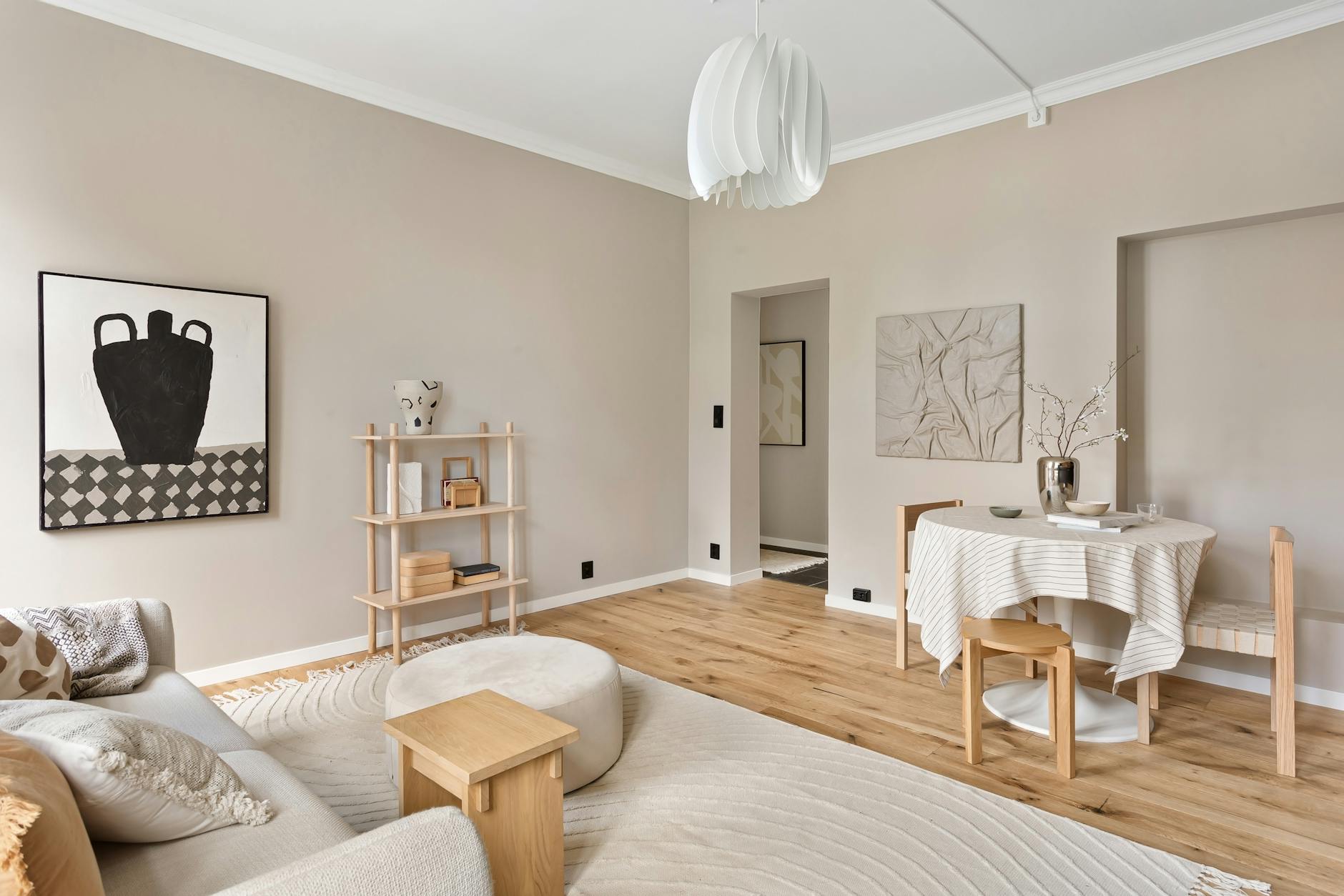
I know the exact white that turned on me. It was the sort of paint developers use when they want a room to look fresh on a brochure: a hard, chalky white that bounced the Sydney winter light straight back at me and made the living room feel wiped down rather than lived in. Every other thing I carried home tried to soften it. A tobacco linen cushion. An old timber stool. A ceramic lamp the colour of weak tea. The wall kept winning.
Lately that minor decorating defeat has started to feel less like my own indecision and more like the mood of the moment. In Vogue’s look at earthy colour palettes, designers keep circling olive, sage, tobacco and clay when they talk about calm. House Beautiful’s reporting on overworked living rooms gets to a similar point from the other end: depth can make a room feel steadier, not smaller.
There is a harsher reading under that shift. Homes To Love’s essay on anti-perfection suggests people are not only choosing different colours; they are tiring of homes staged for the camera before the people paying rent or scrubbing the stovetop. Earthy rooms can look thoughtful, sure. They can also feel like a small revolt against showroom white. And I can see the cynical version too: calm becomes a graceful word for a fresh set of expensive instructions.
The room I kept trying to brighten
Most people are asking a plainer question than that. If I paint the room olive, buy the brown sofa or swap the bright white lampshade for something oat-coloured, will the place feel warmer or simply darker? It is not a trivial question in a compact flat, where every choice has to do at least two jobs. What comes through both Vogue’s piece and House Beautiful’s designer advice is that blankness is not the only way to make a room breathe.

When David Flack of Melbourne’s Flack Studio told Vogue why muddy neutrals are resonating, he was really making a case for continuity rather than drama:
Muddy neutrals feel like a warm hug—they can command a larger space and a through-line with connecting colors throughout the home.
David Flack, Vogue
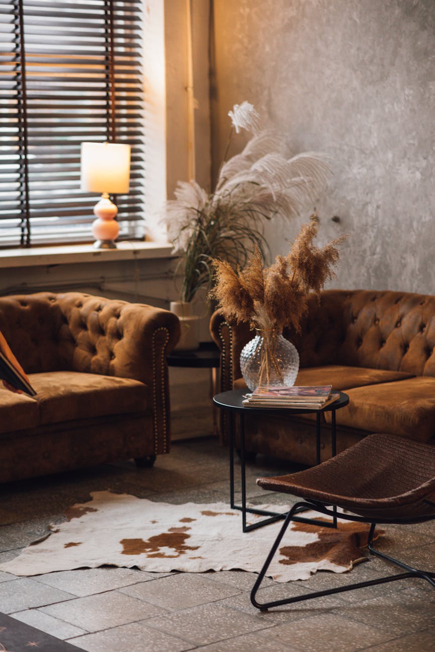
The through-line is the part that matters. People talk about earthy interiors as if they are a single wash of terracotta and brown, but the rooms that work best are more tonal than themed. Olive against timber. Putty beside rust. Upholstery that belongs with the floorboards instead of arguing with them. Less glamour, maybe. Also less strain. The room stops performing cleanliness and starts taking daily life on the chin.
Elizabeth Graziolo of Yellow House Architects, also in Vogue, put it more bluntly:
If our client is looking for a calm space, these types of colors are where we try to steer their direction.
Elizabeth Graziolo, Vogue
I would still hedge the promise. No wall colour is going to repair a nervous system wrecked by a landlord email or three nights of bad sleep. But a room can stop adding to the static. That feels like the more honest pitch, and probably the one people are actually hearing when they reach for clay, oat and brown.
Brown stopped meaning heavy
Some of this is just memory. White interiors were sold for years as neutral, rational and somehow beyond trend, even though they were always as coded as everything else. Homes To Love’s anti-perfection piece argues that Australians are tiring of that picture-perfect register. The backlash is not only about colour. It is social as well. A room with scuffs, patina and a few tonal complications reads less like an audition and more like a place where somebody actually drops their bag at the end of the day.

One of my favourite reminders that white was never the timeless answer comes from Business Insider’s tour of Marble House, which revives Alva Vanderbilt Belmont’s complaint that pure white marble would have created a mausoleum effect too cold for daily comfort. Slightly theatrical, yes, but she was not wrong. Brightness can tip into chill. A pale room can be elegant and still feel inhospitable by six o’clock.
Interior designer Louis Lin told House Beautiful that darker, warmer rooms can do something white ones often cannot:
Rich colors create a sense of immersion that allows the boundaries of the room to dissolve.
Louis Lin, House Beautiful
Translated out of designer-speak, the point is practical. People are starting to trust atmosphere over glare. That does not mean every Australian living room is headed for aubergine walls and velvet drapes. It means brown has stopped signifying heaviness on its own. Olive no longer reads gloomy by default. Clay can feel breathable, especially beside old timber, linen and a floor that has taken a little sun.
Calm can still become a costume
This is the bit where the skeptic has a fair case. The design world is very good at taking ordinary wants, rest, softness, quiet, and selling them back as a neatly merchandised aesthetic. If you have ever stood in a homewares shop holding a forty-dollar stoneware cup in a shade called mushroom, you know the feeling. Earthy colour is not the problem. Turning calm into another high-control look is.

That is why I keep coming back to the gap between tonal rooms and styled ones. Homes To Love’s analysis of the anti-perfection mood is convincing because it treats imperfection as part of the point, not as decoration sprinkled on top. The same goes for Business Insider’s report on a mud-built villa in Rishikesh, where the earth-toned interiors feel airy because the material logic is doing most of the work. The walls, floors and objects seem to belong to the same weather system. Nothing is straining to prove it has taste.
That, to me, is the answer to the skeptic’s question about whether calm is only new marketing. Sometimes it is. Often, actually. But the rooms that feel calmer in this cycle are not rescued by a rust throw and a grounding caption. They relax because they give up a little perfection. They let the timber show its age. They accept a softer edge. They stop insisting that every surface look hard, bright and obviously expensive.
What Australian homes already knew
Australian interiors, at their best, have been rehearsing this move for years. Homes To Love’s feature on a Yarra Valley house built with recycled materials and timeworn pieces works because the rooms feel settled into their own skin, not because it happens to align with a trend cycle. Likewise, its round-up of weatherboard homes around the country shows how colour lands differently when it has weather, grain and history to lean against. A bold paint choice on a weatherboard façade does not feel like a stunt when the rest of the house already understands patina.
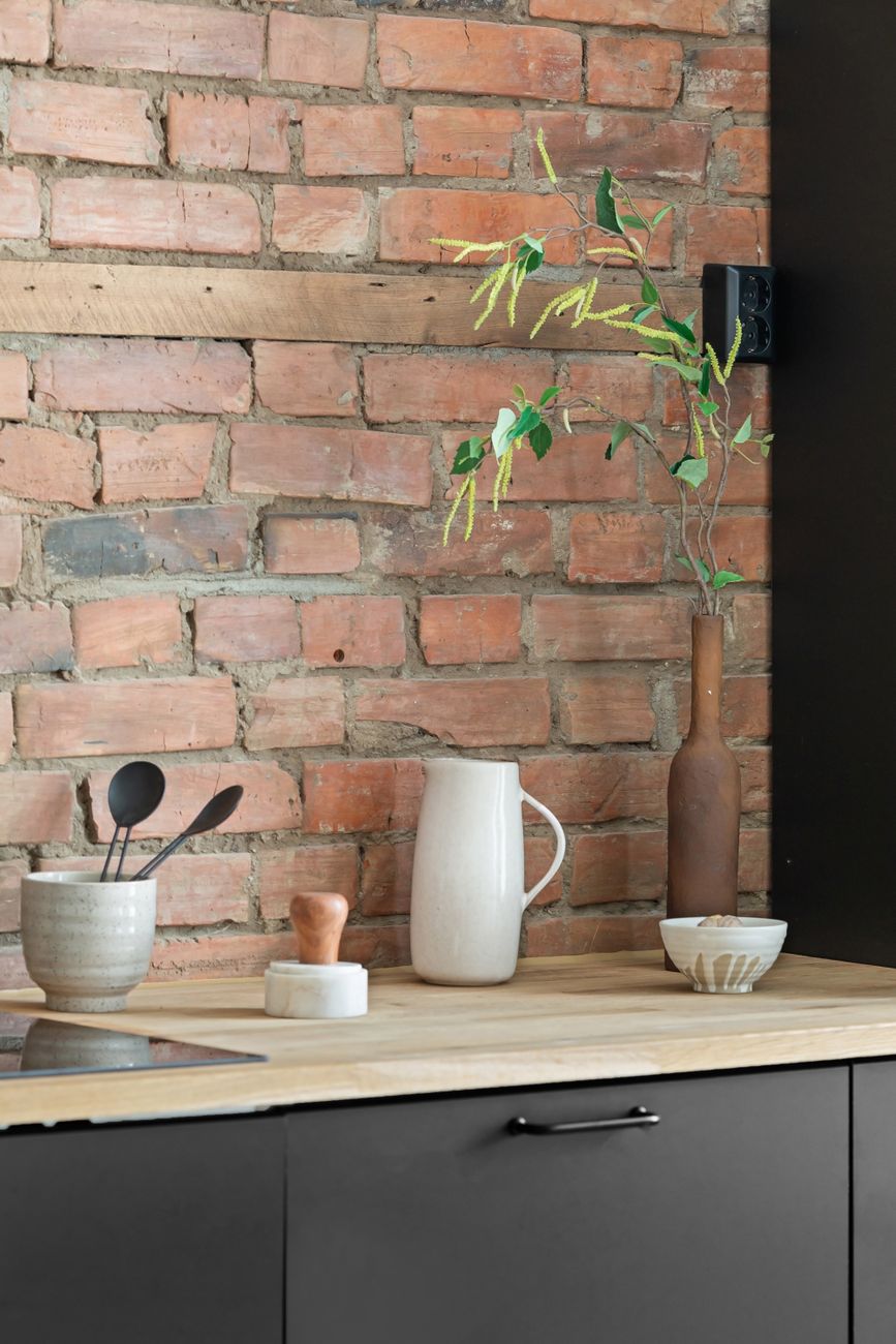
That is probably why the shift feels less imported here than some other interior manias do. Australian light can be harsh. Our homes, especially older or regional ones, tend to reward materials that can take a bit of dust, sun and ordinary wear. The move away from hard white is not only aesthetic fatigue. It is regional common sense. Cream, gum-leaf green, tobacco, ochre and muddier browns sit more kindly with the textures many of us already have: old floorboards, brick, wool, rattan, second-hand timber, stone that is not polished to within an inch of its life.
I do not think the answer is repainting every wall dark and declaring the white era over. That would be its own kind of theatre. The better lesson is smaller than that, and more useful. If a room feels sharp, sterile or slightly unforgiving, the fix might not be more light. It might be less contrast. Not less personality. Just less glare.
That is why the rooms that feel easiest to live in right now are stepping back towards earth. Not because brown is the new beige, or because olive has won a trend cycle, or because designers have suddenly rediscovered warmth. They feel right because they are less interested in impressing you at first glance than in being habitable by Thursday night, when the dishes are stacked, the shoes are by the door and the light has gone soft enough for a wall to stop showing off and simply hold the day.

The Lifestyle Desires brief
Style, food, travel and wellbeing — weekly in your inbox.
Subscribe