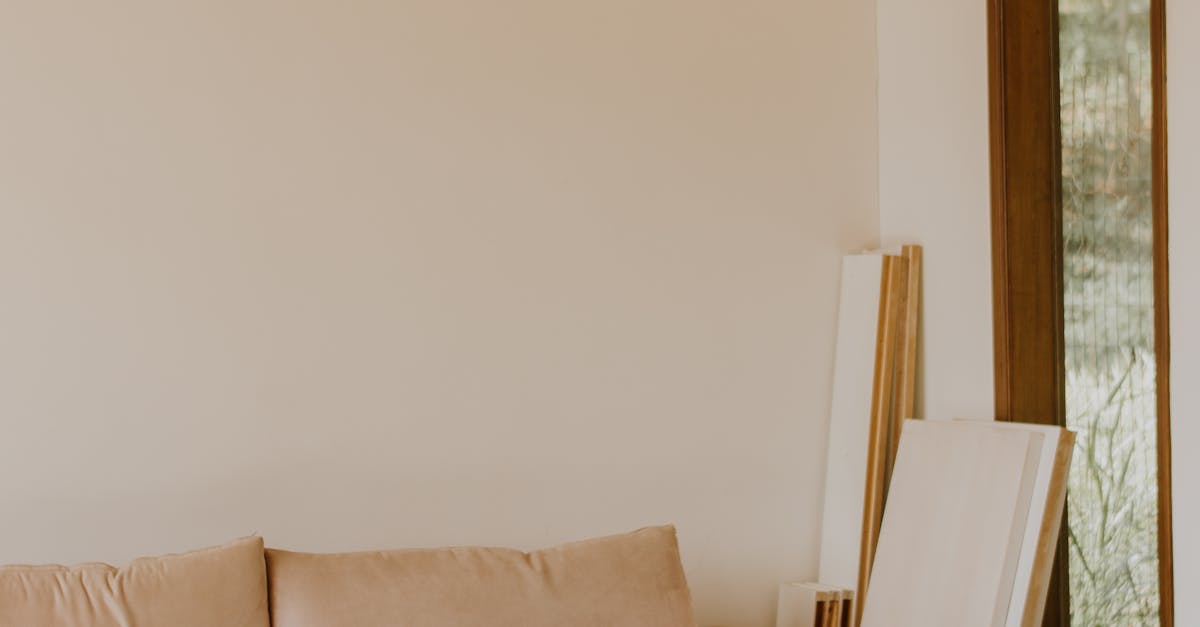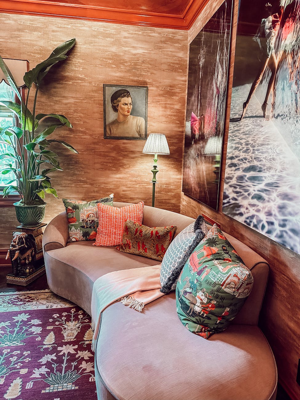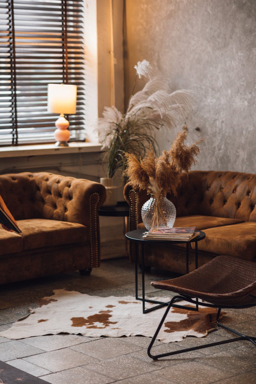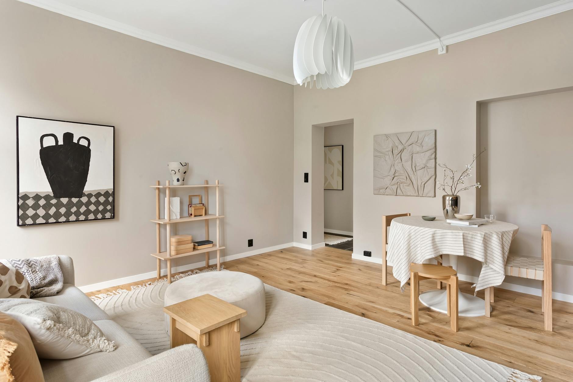
The beige mood board has swallowed the house
Quiet luxury homes are starting to blur into the same beige interior. In 2026 the better rooms feel specific, textured and a little less obedient.
Open enough glossy listing galleries, renovation reels and display-suite walk-throughs this autumn and the room starts to feel preloaded: cream bouclé, pale oak, one curved lamp, one oversized vase with branches that look as if they have never met wind. I have liked versions of this room. I still do, sometimes. Lately, though, I keep having the same faintly eerie reaction: a space can be expensive, tasteful and beautifully lit while saying almost nothing about the person who lives there.
Beige is not the villain here, and restraint has not suddenly become vulgar. Copy a style often enough, though, and it stops reading as discernment. It starts reading as social proof. Rooms on your feed can look finished before anyone has actually lived in them. If you are trying to make a home rather than stage one for resale or Instagram, that sameness starts to feel like a dead end.
In the Sydney Morning Herald’s look at quiet luxury and boho chic fatigue, Sarah Marriott put her finger on the influencer version of the problem.
“The viral trends for a beige and white land of cream-on-cream, it’s what influencers are showing, especially in Byron Bay.”
— Sarah Marriott, SJS Interior Design
More useful still was designer and stylist Jono Fleming in the same report, because his point lands where most normal homeowners actually live: somewhere between aspiration and a room that still does not feel like them.
“After doing 80 consults last year … those who have gone with beige will say, ‘it still doesn’t look like me’.”
— Jono Fleming, The Sydney Morning Herald
The room that forgot its owner
Neutrals won for reasons that were never silly. They photograph cleanly. They flatter weak natural light. For anxious renovators, they can feel like the safest possible choice. In a housing market obsessed with value, beige also carries the reassuring hum of resale safety. A pale room asks very little of the next buyer. It offends no one. No wonder it travels so well online.

None of that makes a room personal. When House Beautiful asked designers which trendy home additions already looked dated in 2026, the argument was not really about outlawing trends. It was about what happens when surface choices are made for the feed rather than for the way a room works. A sculptural side table, a limewashed wall or an arch can all be lovely. They curdle fast when they are installed as shorthand for taste.
Maybe that is why I do not buy the idea that the backlash is against minimalism itself. Restraint can still be gorgeous when it has a point of view. Recent Homes To Love tours of a Vaucluse family home built around warm minimalism and a designer’s Paddington terrace make the distinction nicely. Those homes are pared back, yes, but their materials, existing bones and odd corners still feel authored. They have texture, memory, some friction. The problem is not the pale wall. It is the pale wall plus the pale sofa plus the pale rug, then the feeling that every decision came from the same algorithmic mood board.
A little noise, finally
Instead, what seems to be arriving is smaller and more convincing than maximalist chaos. A room lets one or two slightly strange things stay in frame. A shelf looks collected rather than styled. A lamp has some humour to it. A tiled splashback does not apologise for its colour. The better countertrend is less about buying louder objects than letting a house show signs of preference.

You can hear that pitch around the return of IKEA PS 2026, a 43-piece range and the tenth edition of the line, which lands in Australian stores on 4 June and online from 18 June. In Homes To Love’s coverage of the launch and Sydney staycation tie-in, Patricia Routledge made the pitch in almost emotional terms.
“Playful design feels more important than ever because people are looking for homes that bring a sense of joy, personality and emotional comfort into everyday life.”
— Patricia Routledge, IKEA Australia and New Zealand
Fair enough. But how do you make play usable, affordable and not gimmicky? The strongest answer in the current coverage is that personality has to do a job. A chair can be bright if it is also comfortable. Open shelving can be expressive if it also holds the books you actually reread. Even the new playful interiors argument from Homes To Love reads less like a manifesto for clutter than a case for rooms that feel inhabited rather than perfected.
Labels come and go, so I would not bet much on playfulism. Still, the analyst read on this shift feels right. Colour has crept back into supposedly practical rooms, including the laundries and utility spaces highlighted in recent Homes To Love design coverage. So has the scepticism attached to expensive sameness. Underneath all of it sits the homeowner question: if my house is meant to hold my life, why does it look as if it belongs to a rental campaign?
So maybe the answer is more modest than a full reno. A neutral room usually does not need to be blown up. It needs one or two decisions that break the spell. Keep the linen sofa if you love it. Add the chair that does not match. Put the ugly ceramic bowl back on the table because your aunt made it. Let the shelves get bookish. Choose the darker timber. Let one part of the room risk being specific. The Australian homes that age well are often not the ones that chased novelty hardest, but the ones that left enough evidence of a person being there.
Beige will survive this, and it should. Australian light can do beautiful things with quiet materials, and there is a reason warm minimalism still has such a long tail. What feels finished, I think, is the era in which a good home had to look vaguely anonymous to qualify as stylish. The beige mood board had a useful run. Now it might be time to let the house answer back.

Sydney inner-west design editor with a soft spot for honest materials, sun-bleached palettes and homes that age well. Ex-Real Living.
The Lifestyle Desires brief
Style, food, travel and wellbeing — weekly in your inbox.
Subscribe