Why Kmart is walking shoppers back to the door
Kmart checkouts are moving back to store entrances, a tiny layout reversal that says a lot about how we want budget home shopping to feel.
The checkout sounds like a minor detail until a chain as mood-defining as Kmart decides the middle of the shop no longer feels right.
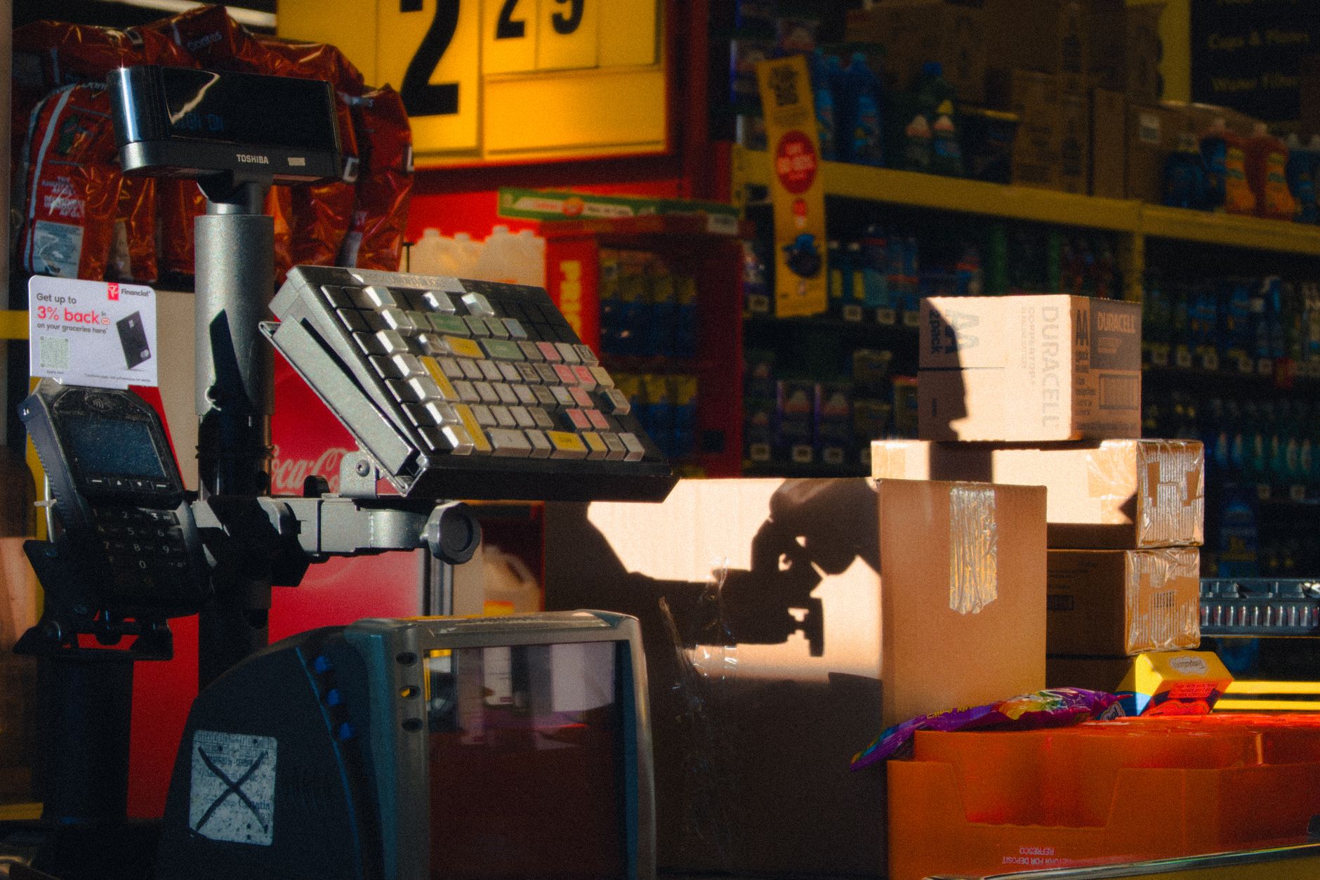
In my head, the old feeling is embarrassingly easy to summon. You go in for a fitted sheet, because the one at home has started pinging off the mattress at 2am like it has a grievance. Ten minutes later there is a lamp shade under your arm, a packet of bamboo drawer dividers in the basket, maybe a $9 ribbed tumbler you did not need but can suddenly picture on the kitchen bench. Only then do you look for the way out and realise the till is sitting somewhere in the belly of the store, not at the door where your body expects it to be.
That small moment of disorientation matters. Under its Plan C+ format, Kmart is moving checkouts back to the front of Australian stores, with 16 stores already converted and 40 planned by the end of 2026/27. For a retailer with roughly 300 Australian stores, this is still a trial, not a national reinvention. Still, it reads like a confession. The central-checkout era may have made sense on a floor plan. It did not always make sense in a body.
Kmart’s official line is warmer than that, of course. Group managing director Aleksandra Spaseska has framed the new format as a better use of space, with more emphasis on beauty and home. She told reporters:
It is delivering improved space allocation, better visual merchandising, and an enhanced beauty experience.
Aleksandra Spaseska, Kmart Group managing director
The phrase I keep coming back to is not “visual merchandising”, though. It is “improved space”. Not improved products. Not sharper prices. Space. The thing you feel before you buy anything.
The store got too clever for the errand
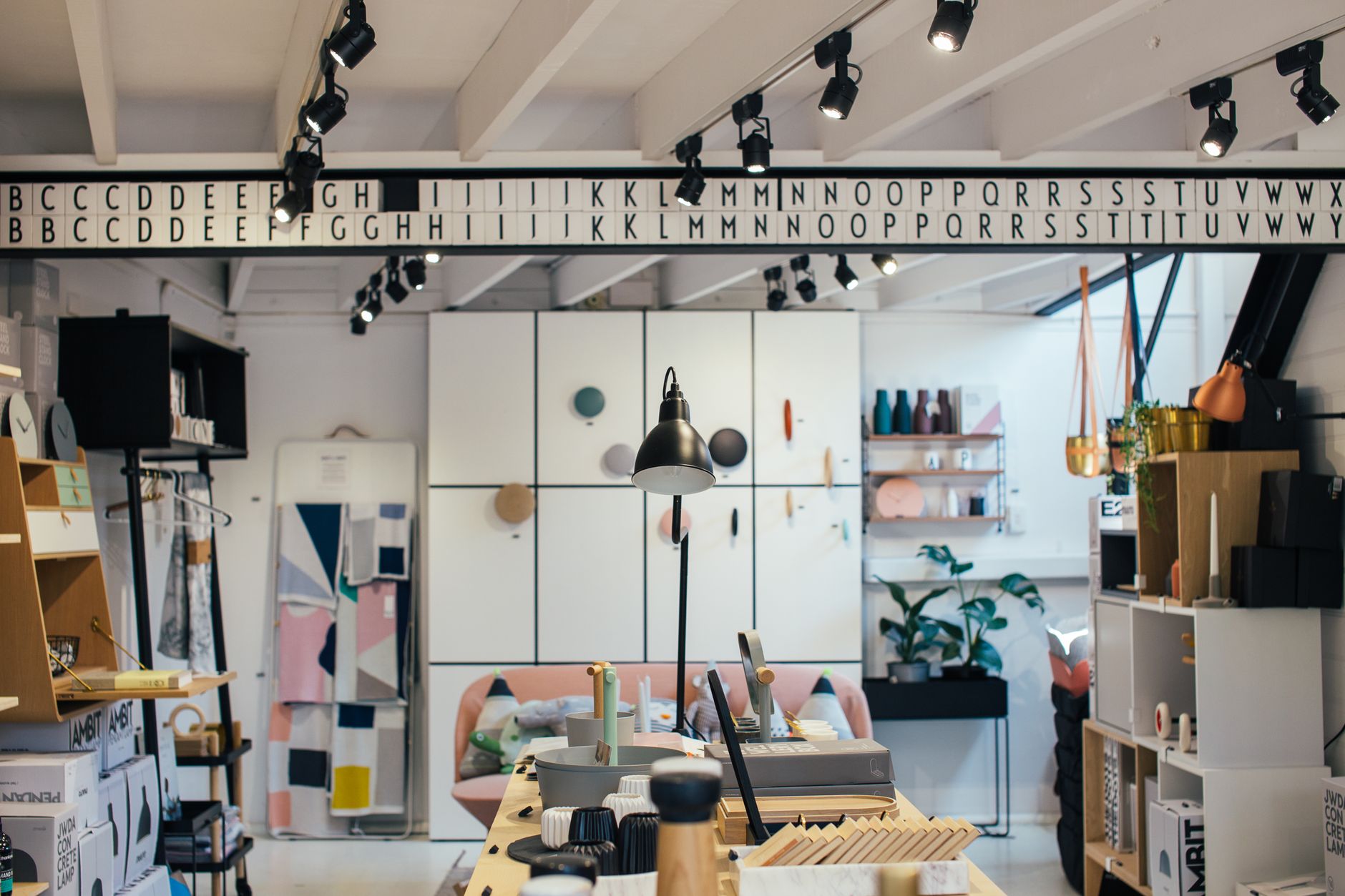
There was always a logic to Kmart’s centre checkouts. Put the payment point in the middle and customers move deeper through the store. They pass more categories. A person sees the throw cushions, the kids’ socks, the storage tubs, the cheap mascara, the pet bed that looks suspiciously like a small boucle sofa. Retail choreography, dressed as convenience.

Being led is different from being trapped. A bargain shop has to perform two jobs at once. Low price needs to feel exciting, not mean. People also need to leave without feeling as if they have fought the room.
That second job has become more important. I doubt it is accidental that this reversal is happening while Australian households are doing the tight little mental arithmetic of winter: petrol, rent, power bill, groceries, the birthday present for a seven-year-old who wants something plastic and highly specific. In that mood, a confusing shop is not charming. Another chore with fluorescent lighting.
Here the shopper’s perspective splits from the retailer’s. Inside the transformation team, a longer path can mean more discovery. Better sightlines. Stronger cross-shop between home, beauty and apparel. To the person holding two pillowcases and a toddler’s drink bottle, the same path can feel like the store has moved the door away.
Customer backlash to centre checkouts was never only about queuing. It was about expectation. Most of us understand the ritual without thinking: enter, browse, pay, leave. Put the till in the centre and the store asks the shopper to relearn the ending. Petty? Maybe, until you remember that Kmart’s genius has always been its lack of ceremony. It sells the fantasy of a home reset without making you audition for it.
Customers elsewhere have described the reversal as a “common sense” move, which is one of those phrases that can sound dull until you sit with it. Common sense is underrated in retail design. Hooks at shoulder height. A trolley that fits through the aisle. A payment point appearing where the brain expects an exit to appear.
Not glamorous. Useful.
The warmer path is still a selling machine
Pure customer empathy would be too generous a read. Kmart is not moving checkouts out of the goodness of its navy-blue heart. The new layout still wants bigger baskets. It still wants the person who came in for school socks to drift past beauty and home before leaving.
Spaseska has been clear that the format is a test. In another report on the rollout, she said:
We will use the trial to learn quickly, refine the model, and assess the longer term opportunity.
Aleksandra Spaseska, Kmart Group managing director
A retailer watching behaviour, not vibes, writes a sentence like that. The behaviour Kmart wants is fairly plain: calmer movement, better category performance, more reasons to add one last thing.
Packaging is what has changed. The old centre-checkout store felt like a maze with bargains. The new version, at least in theory, sounds closer to a loop that returns you to daylight. Same commercial goal, softer hand on the shoulder.

Seen beside Kmart’s home push, the checkout move starts to make more sense. The company has been testing K Home, a standalone home and furniture concept, and the shift sits beside its digital experiments rather than apart from them. SmartCompany reported last month that Kmart’s AI shopping assistant, Joy, lets customers preview furniture and homewares in their own spaces before buying. Paul Migliorini from Google Cloud Australia put the tech pitch bluntly:
AI represents a massive opportunity for retailers to completely redefine the shopping journey.
Paul Migliorini, Google Cloud Australia
I am less dazzled by the AI part than by the word “journey”. Retailers love it. Shoppers tolerate it. What we often want is less poetic: can I see the thing, picture it at home, pay for it without losing my mood, and get back to the car before the ice cream softens?
Still, the physical and digital pieces are aiming at the same anxiety. Homewares are intimate. Even the cheap ones. A lamp has to live with your couch. A quilt cover has to survive your actual bedroom, with its cords and laundry chair and too-small bedside table. For years Kmart has proved that low price does not have to look hopeless. Now it has to prove that buying low-price style can feel less like a scramble.
There is a broader home mood around this too. Realestate.com.au recently argued that Australian interiors are moving away from spaces that feel overly polished or impractical and towards rooms that feel warmer, more personal and easier to live in. That piece was about decorating, not retail operations, but the emotional weather is similar. People are tired of spaces that look good in theory and grate in use.
A shop is a room too. Kmart may be learning that the hard way.
Budget design has to feel humane
What interests me most about the checkout reversal is its treatment of friction as a design flaw, not just a customer-service complaint. Budget retail sometimes forgets this. Cheap does not cancel out annoying. If anything, the cost-of-living squeeze makes annoyance sharper, because shoppers are already arriving with less slack.
The sceptical read is fair: perhaps this is just merchandising dressed up as kindness. Move the tills, rework the departments, polish the beauty area, call it an experience. If the path to the front happens to pass a few more tempting displays, nobody at head office will weep.
Retail design does not have to be morally pure to be revealing. The fact that Kmart thinks a calmer exit might sell better tells us something about the moment. Value is not just the number on the swing tag. It is the whole exchange: the price, the time, the irritation, the little spark of finding a lamp that makes a rental living room feel less temporary.
I might be over-reading a checkout. Occupational hazard. Kmart occupies a strange place in Australian domestic life. It is not aspirational in the old glossy sense, yet it has become a kind of mass mood board: scalloped bowls, boucle chairs, arched mirrors, ribbed glass, the affordable version of whatever the internet has decided is tasteful this quarter. A store layout is not neutral. It shapes how a huge number of people encounter the idea of a nicer home.
That reach shows up in stranger corners of the culture too. A recent Conversation analysis of Australia’s shrinking bookshop sector named discount department stores such as Kmart and Big W as part of the pressure on smaller retailers. Kmart is not just where people buy towels. It is one of the places deciding what cheap, accessible domestic life looks like.
Walking shoppers back to the door feels bigger than a till relocation because of that. It is an admission that the cheapest version of taste still needs ease. Perhaps especially then.
At its best, Kmart lets you leave with the small pleasure of having solved something. A drawer. A corner. A bathroom shelf that has been irritating you since March. If the store makes that harder than it needs to be, the bargain starts to sour.
So yes, put the checkout near the exit. Let the errand end where the shopper expects it to end. Sometimes good design is not a dramatic reveal or a clever path through the whole shop.
Sometimes it is simply the door, waiting where it should be.

Sydney inner-west design editor with a soft spot for honest materials, sun-bleached palettes and homes that age well. Ex-Real Living.
The Lifestyle Desires brief
Style, food, travel and wellbeing — weekly in your inbox.
Subscribe