What a bathroom showroom now understands about renovation fatigue
Sydney's new Reece Rosebery showroom suggests bathroom retail is now selling relief: calmer choices, steadier pacing and help for renovators already worn thin.
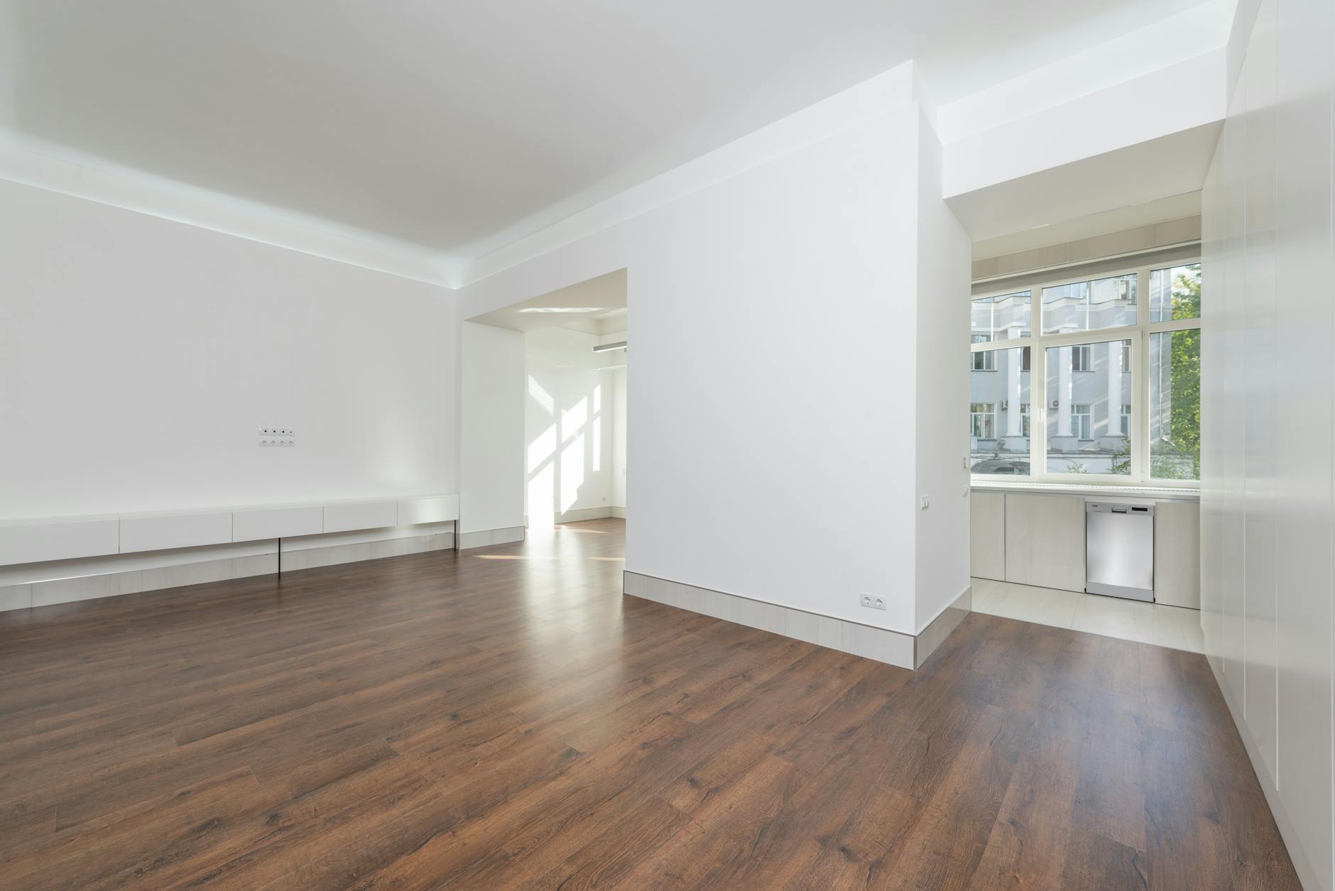
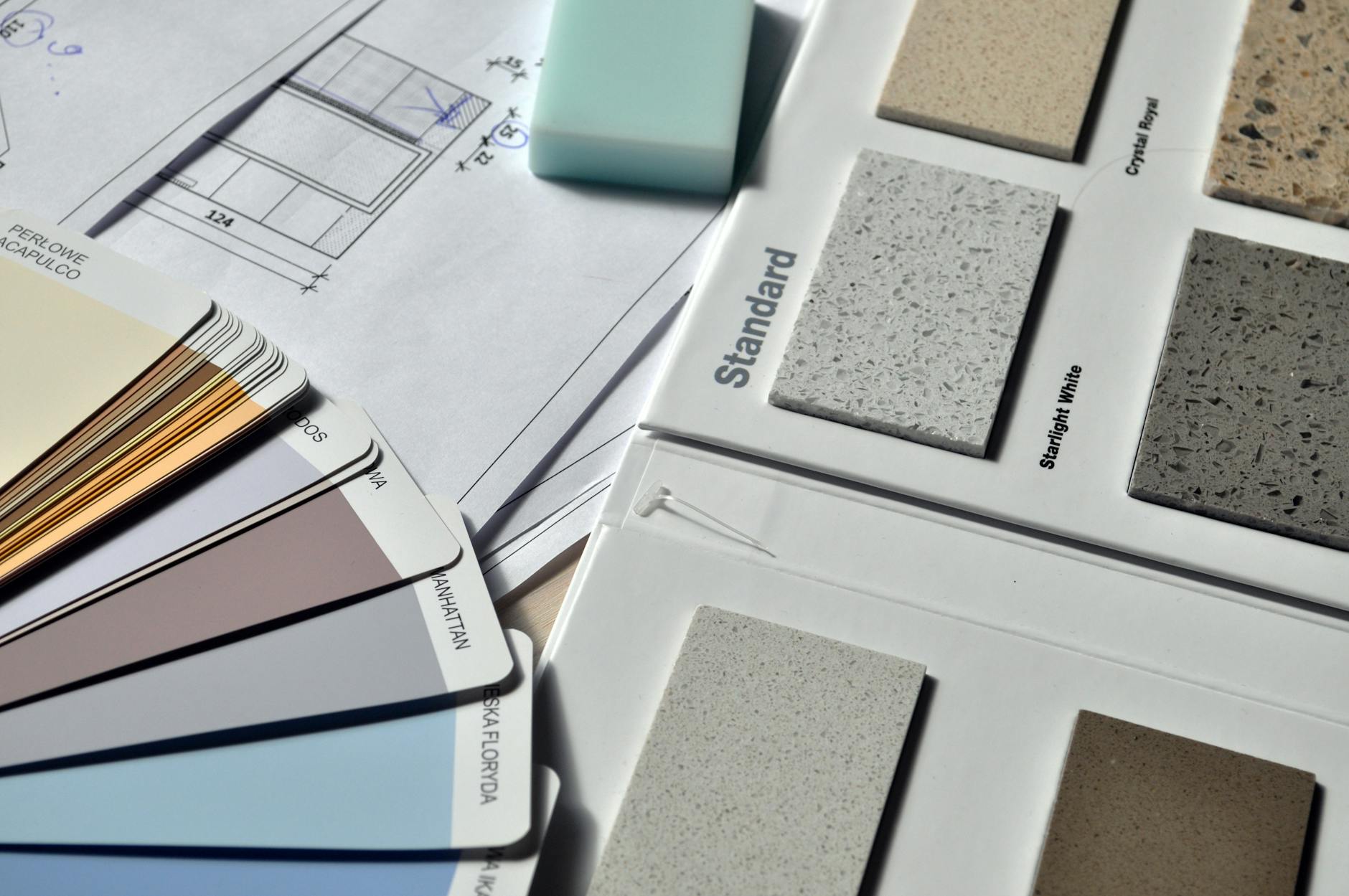
Choose a bathroom once and you discover how quickly taste turns into admin. There is grout, a builder, a budget ceiling, and that precise domestic moment when everyone in the house stops pretending the dust is fine. Renovation fatigue rarely arrives with a bang. It creeps in through off-whites that all look different by sample five, tapware finishes that change under showroom lighting, and the small embarrassment of forgetting which basin you swore by half an hour ago.
What caught my eye about the new Reece showroom in Rosebery was not the obvious stuff. Sydney has no shortage of handsome rooms full of tapware. The more useful story is that a large retailer seems to have finally clocked what renovators already know in their bones: the sale is no longer only about fixtures. It is about making the choices feel survivable.
Stand in one spot and this looks like a retail story. Move half a step and it becomes a story about nerves. Homeowners experience the strain as something intimate and a bit embarrassing. Retail designers see a problem of choice architecture. The showroom team sees a simpler commercial fact: if people arrive foggy, tense and half-defeated, the smartest room may be the one that edits the options before anybody speaks.
The room where people unravel
On paper, a bathroom project looks small. In practice it reaches into mornings, privacy, mess, money, and the low simmer of resentment that appears when a house stays half-finished for too long. That helps explain why this story lands now. Australia’s renovation culture has become more emotionally loaded, not less, with skilled-tradie shortages stretching timelines and even modest jobs taking on the tempo of a second occupation.
Across the local design conversation, I keep seeing the knock-on effect. The renovation pieces that linger are not dreamy fantasy tours so much as pragmatic meditations on scope, sequencing and restraint: budget-minded updates that ask what you can keep, small-space ideas that ask what you can remove, layouts that try to make a room feel calmer before they make it feel expensive. Homeowners are not just shopping for beauty. They are shopping for relief from the feeling that every single choice might have to be lived with for the next decade.
From the homeowner side, I suspect this matters more than retailers usually admit. Once a renovation drags, taste becomes conservative. People stop asking what they really want and start asking what is safest, what is quickest, what will not require one more meeting. The question hiding inside all that product browsing is not Which tap? It is How do I get through this without regretting it?
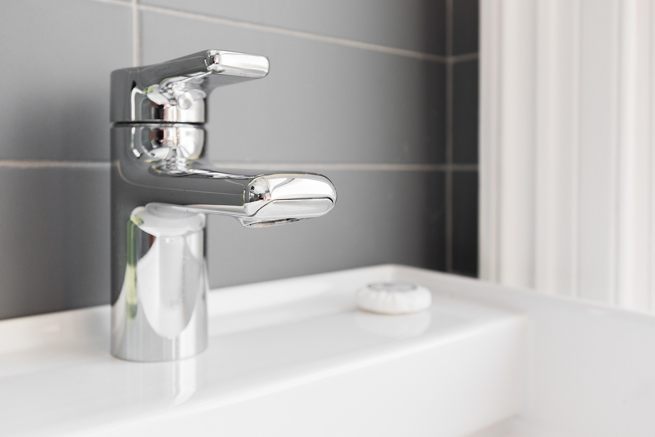
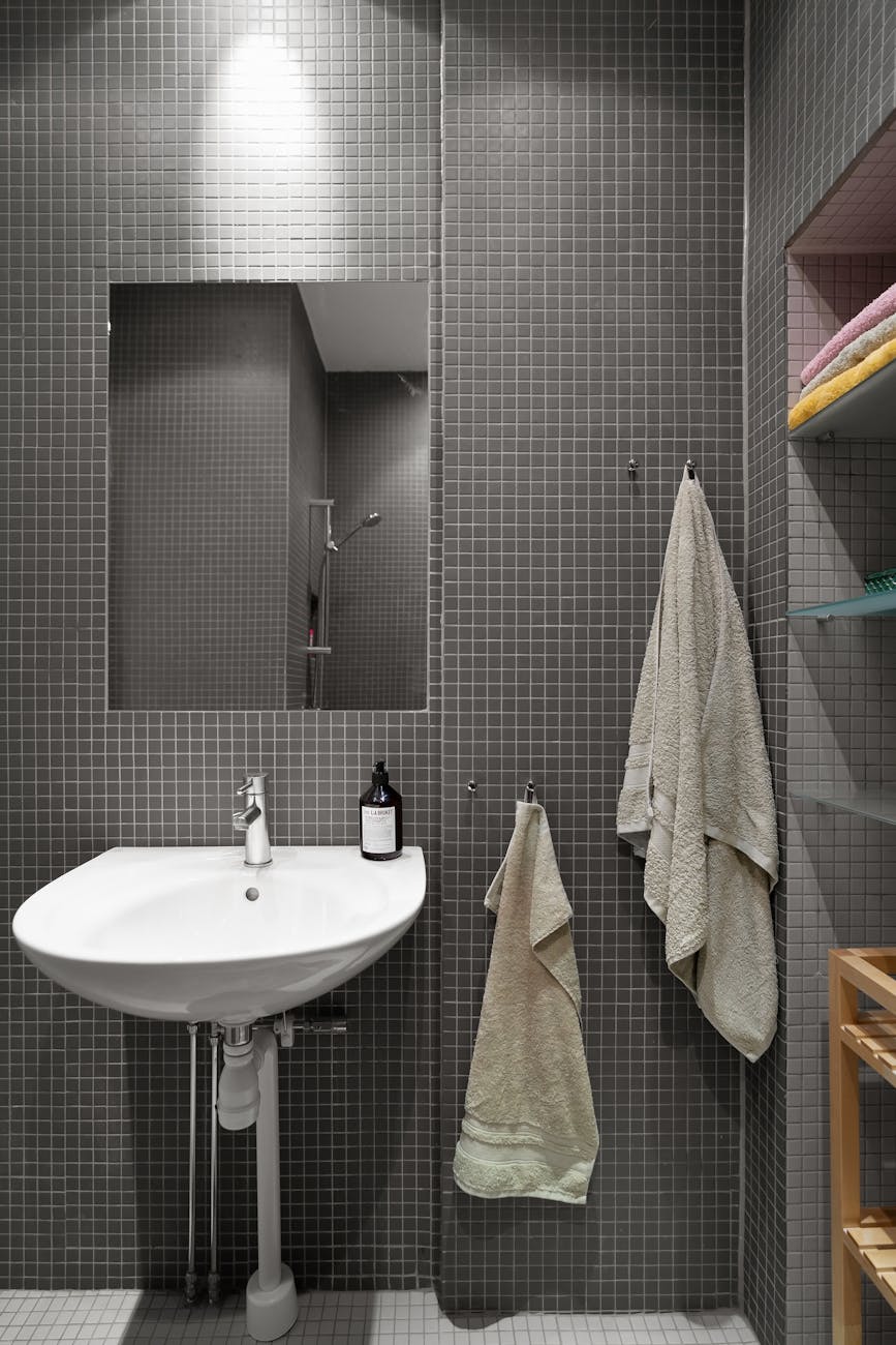
Which is why bathrooms are especially unforgiving. Kitchens at least announce themselves as social. Living rooms can hide a compromise in plain sight. A bathroom keeps score. The grout line you rushed, the tap you settled for, the storage you forgot to ask for: they all return every morning. No wonder people freeze.
A better kind of narrowing
Cooler, yes, but the analyst’s read is not wrong. When organisations design better choosing experiences, they do not always win by offering more. In A Better Choosing Experience, the argument is almost blunt: people choose with more confidence when complexity is reduced, comparisons are legible and the path forward feels edited rather than endless. That logic carries neatly into the bathroom world, where every category multiplies into ten micro-decisions before lunch.
From the showroom side, a trade publication, phcppros, makes much the same case: fewer, clearer options and stronger guidance can lower cognitive load and help customers move with conviction instead of stalling. That still does not answer every question about spend. A beautifully edited room can steer you towards higher-margin choices. I am not naive about that. Still, it gets at the analyst’s basic question about whether a tighter field works better than a sprawling assortment. It probably does, because exhausted people rarely need abundance. They need an editor.
At Rosebery, that is the revealing part. The promise is not maximalism. It is triage. Not a democratic wall of every basin anyone could ever buy, but a controlled environment that says: start here, touch this, compare these finishes, let somebody walk you through the part where your eyes glaze over. There is something almost merciful in that.
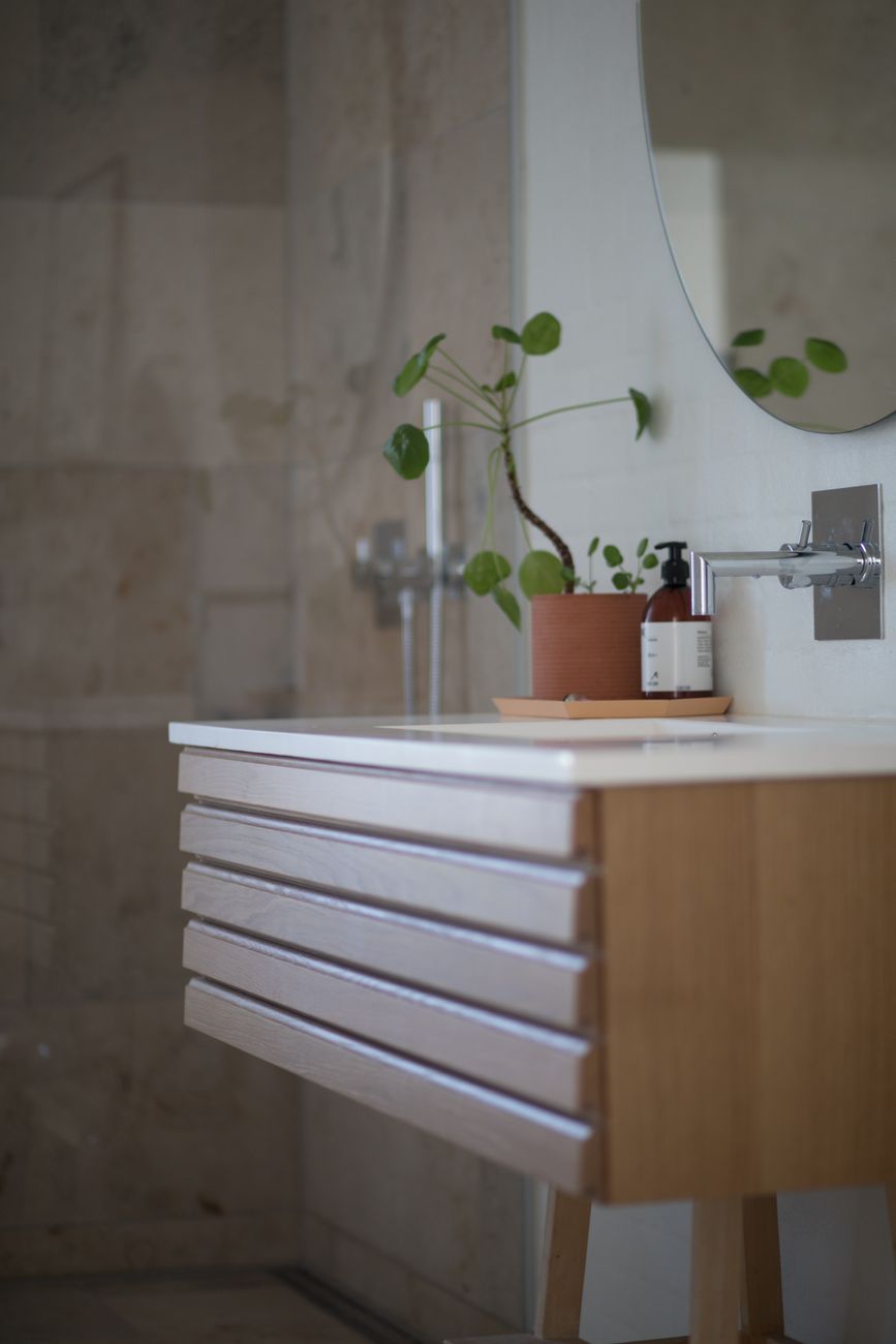
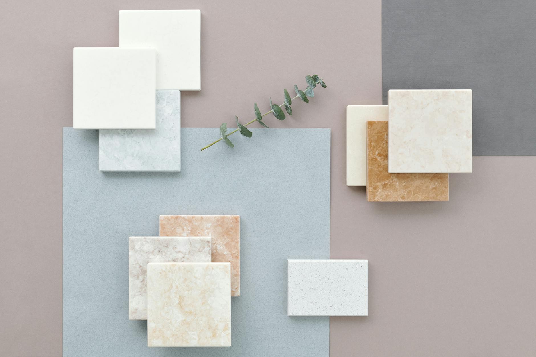
Then there is the relief of having a palette held steady for you. Design people underrate it. A good room editor does not just remove options; it stops each fresh idea from blowing up the last one. Stone speaks to tile, timber softens metal, the basin makes sense once the vanity scale is fixed. That is not anti-creativity. It is what lets creativity survive contact with procurement.
Hospitality, with a floorplan
Inside the pitch, the logic is more deliberate than a lifestyle glossy finish might suggest. In Reece’s own account of the Rosebery concept, the company describes a format that combines consultation, physical touchpoints and design guidance rather than straight catalogue display.

“bringing together human expertise, tactile product experiences and expert design guidance”
Jason Pollard, Reece
Yes, that is corporate language. It still circles a real shift. The showroom is trying to behave less like a warehouse of aspirations and more like a place where somebody can reduce the mental load on your behalf. The cafe, the concierge feel, the workshop logic, the slower appointment energy: all of it suggests the room understands that bathroom planning now involves managing a client’s nervous system as much as their brief.
You hear the same thing in Retailbiz’s report on the opening. Nat Momsen, who worked on the project, put it more plainly than most launch copy usually manages:
“creative thinking and technical problem-solving happen side by side”
Nat Momsen, retailbiz
It lands because the line names the split-screen most renovators live inside. One half of the brain wants a room with proportion, texture, warmth, maybe even a little pleasure at 7am. The other half is calculating installation tolerances, delivery delays and whether the person doing waterproofing will answer the phone. Rowan Lodge, the consultant quoted in the Reece material, says the design language drew on fashion, art movements and colour forecasting. Fine. But the more revealing design reference might be the spreadsheet. The calendar. The text thread with the tiler. That is the emotional architecture the room is really answering to.
What clarity is worth
Then comes the harder question: is this kind of showroom calm a genuine service or simply a more sophisticated sales technique? I suspect it is both. Retail has always borrowed from hospitality when it wants people to stay longer and spend more generously. A bathroom showroom that feels less frantic may still be leading you towards a premium vanity package. Restraint can be persuasive. Warm lighting is not neutral. Neither is the feeling that somebody competent has taken the wheel.

Even so, I do not think the answer is to sneer at the comfort layer. Home projects have become dense with friction. Builders are in short supply. Costs keep reshaping what counts as modest. Even media that sells aspiration has tilted towards the practical, whether it is cost breakdowns for kitchen work or profiles of homes that feel timeless because somebody knew where to stop, not because they kept adding. In that environment, a well-edited showroom is not just mood. It is a tool.
If that sounds unromantic, good. The romantic language around renovation is often what leaves people stranded. We talk about transformation, then hand over fifty tiny decisions with no agreed order. A calmer showroom cannot solve the plumbing, or the invoice, or the contractor who pushes your date by three weeks. It can make one afternoon of uncertainty feel less diffuse. That is not nothing.
At heart, the user-affected question is which support makes a bathroom project feel survivable rather than overwhelming. The partial answer, if Rosebery is reading the room correctly, is not endless inspiration. It is sequence. Fewer visible choices at once. Tactile reassurance. Someone who can translate taste into order. In other words, not more design exactly. Better pacing.
Maybe that is why I keep coming back to it. It says something larger about home retail in 2026. The old fantasy was abundance: the more options in front of you, the freer you were. The newer fantasy is clarity. A householder walks in overcaffeinated, underinformed, slightly scared of making an expensive mistake, and what they want is not a cathedral of possibility. They want a room that has already done some of the thinking.
Small shift on the surface. A showroom changes its mood, tightens its displays, adds a layer of guidance. Underneath sits a blunter admission about the way many of us live now. Renovation is not exhausting because we lack taste. It is exhausting because domestic decision-making has become its own unpaid labour. If a bathroom showroom has started to understand that, it may be telling the truth about modern home design more clearly than most design rhetoric does.

The Lifestyle Desires brief
Style, food, travel and wellbeing — weekly in your inbox.
Subscribe